Ignatius Friend
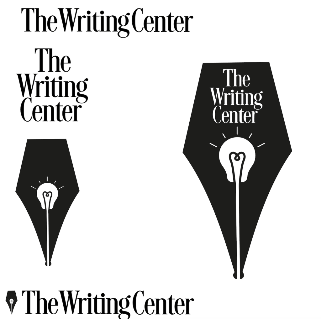
This month I designed a logo for the writing center. It was difficult to come up with multiple designs, especially with the restrictions of not using a pen. I toiled then I had an Idea when I was just drawing symbols of the things I associate with writing. So I sketched a light bulb and then a lamp then I changed how I decided I wanted to do an in-wash which led me to want to use my dip pen. this is when I started to heat up when I started drawing it while I was using it, then I decided even though it’s a cliche direction what if I combined them? The pen and the lightbulb could fit together. I tried and tried then I figured out how to make it one thing. the way I managed to use negative and positive space was influenced by a TikTok I saw while half paying attention to a movie. The magic came to be when I found the typeface that I felt would feel serious but not in an intimidating way. then I converted the type to outlines and couldn’t find it. this is what can easily be considered a rookie mistake. luckily enough I retraced my steps and found the typeface but it wasn’t without its hiccups. first I used whatdafont.com to identify it but that didn’t produce promising results because I found the font in Adobe. I remember thinking of newspaper font so I just searched for that but that was not successful either. so when it felt like It was time to give up I remembered that my iPad is loosely connected to my MacBook but I don’t often open Adobe on it so it needs to renew fonts and I scoured the recently added font and found it. Well, I only found the family but this is better than nothing so I looked through that and eventually achieved the goal I set out on and felt a wave of relief. So now make sure to notate the typeface I use before I convert to outlines just in case.
