March! Alaiza’s Reflections and Collaborations: VCAD

Alaiza Washington

During the duration of this course, Julia and I have collaborated on various projects, and I found these collaborations particularly enriching. What stands out the most to me is our dynamic of mutual support and creative synergy. Whenever one of us feels burnt out or stuck, the other steps in seamlessly, keeping the momentum of the project alive and reigniting each other’s creativity.

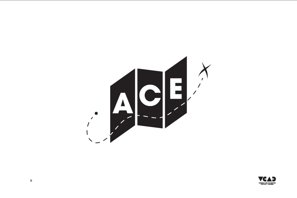
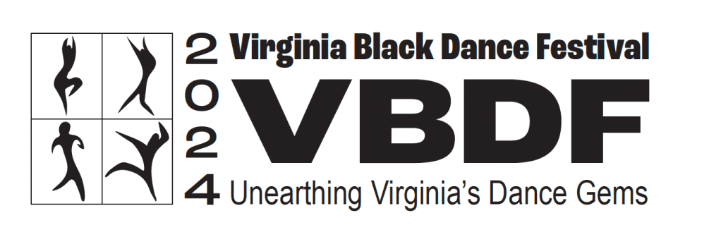
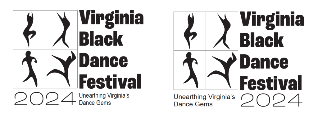
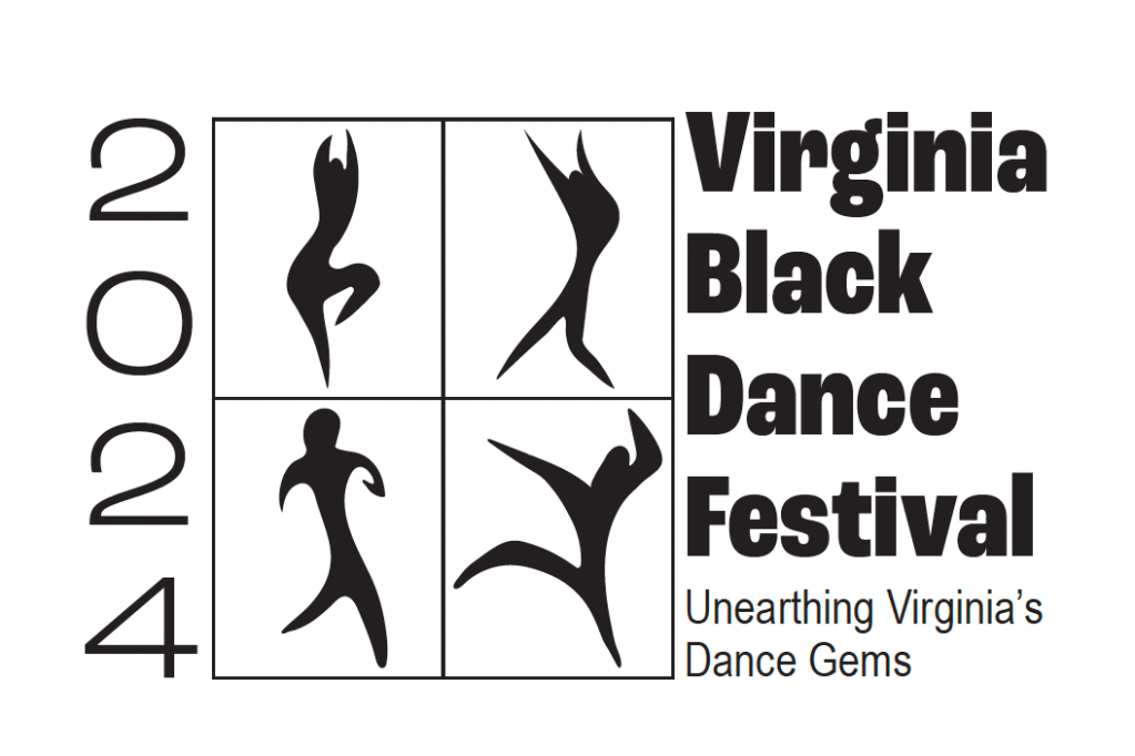
One aspect of our collaboration that I value greatly is the feedback loop we’ve established. It’s not just about receiving input from an external perspective, but also about sparking fresh ideas and perspectives within ourselves. For instance, while working on the Ace Logo project, there were moments when both of us hit roadblocks or experienced burnout. However, instead of letting it hinder our progress, we took a step back, offering assistance and feedback on each other’s designs. This collaborative approach not only revitalized our enthusiasm but also enabled us to generate two distinct design options for the client.

The beauty of our collaboration lies in its resilience and adaptability. We’ve learned to leverage each other’s strengths, filling in the gaps when needed, and pushing each other to explore new avenues of creativity. Our ability to navigate through challenges together has not only enhanced the quality of our work but has also fostered a supportive and inspiring working relationship.

In essence, our collaboration goes beyond mere project work; it’s a testament to the power of teamwork and mutual respect. Together, we’ve cultivated an environment where ideas flourish, challenges are overcome, and creativity knows no bounds. I’m grateful for the opportunity to work alongside Julia and look forward to many more fruitful collaborations in the future.

March! Myra’s Reflections and Collaborations: VCAD

Myra Brooks

The project I had to work on was multiple banner designs for the office of admissions. I collaborated with Ms. Odell and she made the overcomplicated designs I made and made them more cohesive. The client requested a lot of things at once. It got complicated at times but I was able to come up with a great design. He requested banners for an upcoming event for open house. This was to be used to encourage students to apply and attend VSU and showed everything that was offered. Some limitations were having to stick to the VSU logo and color schemes, which I’m not a huge fan of. She challenges were sticking to a certain template and replacing certain aspects of each banner. We worked together and Ms Odell helped me reach deadlines. Thus was my first introduction to how fast paced design work can be.

March! Julia’s Reflections and Collaborations: VCAD

Julia Taylor

For the ACE logo, I worked with Alazia. The director of ACE wants to “rebrand” with a logo which would extend to further deliverables in the future. To start out, she wants a logo for the center. She noted that she is not a fan of the lowercase lettering and spacing of the current ACE logo. She wants the logo to have a fun feeling but also give support. She also wants to symbolize the feeling of belonging. There were not a lot of parameters and limitations to the project. It was a matter of figuring out which direction to go. Of course, we had to stick to ACE for the logotype.

Some challenges that I faced and I am sure Alaiza faced was creative burnout. We would work on our independent variations of the logo and one of us would be feeling very good about it while the other would be burned out. When that happened, we would cheer the other person on and give critiques. In the event that it was just not happening or one of us wasn’t there, one would pick up the slack of the other. I think we really embodied the concept of teamwork. We worked very well together and bounced ideas off of each other. We really got into the creative teamwork mindset. I thoroughly enjoyed working with Alazia. It was a very fun and smooth collaboration. I would like to do future collaborations.

March! Mikala’s Reflections and Collaborations: VCAD

Mikala Hicks

I remember last semester, Andrea Kinneman and I were the only two design managers for the VCAD lab, therefore we had a lot of different projects with clients that we worked on together as well as internal design projects we had to collaborate on. One project I remember we collaborated on together was the George Anthony Micheal presentation for the HBO showing, Master of Lighting, we hosted. I can recall actually being on a different project at the time, but it was one of those instances where I had to pause my project for a second and help Andrea as well as the rest of the crew because we were nearing the date pretty quick and needed more hands on deck. Andrea had one of the people on the design crew creating a flyer, and she was art directing that as well as the design for the presentation of the slide show that he would be presenting off of. I was asked to help with that, and also I was asked to create a small handout with a QR code on it, so everyone could have access to a specific call of action dealing with George Anthony Morton’s personal objective. One of the limitations I had with the handout was that I was asked to complete if during class. Considering it didn’t need to be big or have a lot of information on it, I was able to create and design it that day during class, and we had them printed and ready to handout bye the next day which was also the day of the show. I think my biggest challenge was that I was asked to create it that day, and it wasn’t necessarily the time crunch that was an obstacle. I really had to set aside my perfectionist tendencies, and I had to understand that I wasnt able to change and tweak it over and over again. 

March! Iggy’s Reflections and Collaborations: VCAD

Ignatius Friend

This month I designed a logo for the writing center. It was difficult to come up with multiple designs, especially with the restrictions of not using a pen. I toiled then I had an Idea when I was just drawing symbols of the things I associate with writing. So I sketched a light bulb and then a lamp then I changed how I decided I wanted to do an in-wash which led me to want to use my dip pen. this is when I started to heat up when I started drawing it while I was using it, then I decided even though it’s a cliche direction what if I combined them? The pen and the lightbulb could fit together. I tried and tried then I figured out how to make it one thing. the way I managed to use negative and positive space was influenced by a TikTok I saw while half paying attention to a movie. The magic came to be when I found the typeface that I felt would feel serious but not in an intimidating way. then I converted the type to outlines and couldn’t find it. this is what can easily be considered a rookie mistake. luckily enough I retraced my steps and found the typeface but it wasn’t without its hiccups. first I used whatdafont.com to identify it but that didn’t produce promising results because I found the font in Adobe. I remember thinking of newspaper font so I just searched for that but that was not successful either. so when it felt like It was time to give up I remembered that my iPad is loosely connected to my MacBook but I don’t often open Adobe on it so it needs to renew fonts and I scoured the recently added font and found it. Well, I only found the family but this is better than nothing so I looked through that and eventually achieved the goal I set out on and felt a wave of relief. So now make sure to notate the typeface I use before I convert to outlines just in case.

VCAD: Iggy’s January Reflection Blog

Ignatius Friend

Recently, I was commissioned to take headshots for a client. I’ve known the client for a while, but we only recently started working together. The client specified that the images be taken in a studio. I don’t do much studio photography, so I had to brush up on my lighting knowledge to get the results they wanted. The light in studio situations differs significantly from the concert photography I’ve previously done. Concert photography is thrilling and requires flexibility. Studio photography is controlled, well-planned, and thought-out, and I normally fly by the seat of my pants, so this would be an opportunity for me to sit down and plan beyond simply “taking pictures.” I needed to carry my lights, check batteries, and put up the lighting in a studio that I hired. I had only 15 minutes until my client arrived, so I had to move quickly. The client was amazing, and she was extremely professional and punctual. She arrived early and had her cosmetics professionally done shortly before coming. That is always beneficial and reduces the amount of effort required in post-production while editing. However, she was so adept at posing that I ran out of ideas and poses after about 20 minutes. This surprised me, given that she was not a professional model. There were still around 40 minutes left in the shoot, and I wanted the client to make the most of the time they had scheduled, so I made a decision that I would not have made otherwise. We pivoted and took images in the waiting room, and while the shots were basic, I used props to give them more character and shot from several perspectives to provide variation. Fortunately, the photographs came out beautifully. The client was satisfied, and I went on to photograph the remaining employees at the non-profit. I hadn’t taken photos in a studio in years, but simply being confident allowed me to retain my composure, as well as and perform a fantastic job.

VCAD: Alaiza’s January Reflection Blog

Alaiza Washington

During the past fall semester, I took my required internship course. In July of 2023, I received the opportunity to work with a consulting firm in Texas on creating a brand identity for a former coach at the university. While working with the owner, I was extremely intrigued by her. She was a black business owner, a female leader leading a whole team, and overall a really nice lady. I did all I could to ensure our experience was pleasant to be able to work up to asking her if her team would be looking for an intern. She was on board with taking me in, and we started working right away.

During my internship, I was the only “designer” working with people who are used to having experienced designers work with them. This was a little scary for me. I found myself being slightly less confident. I couldn’t explain why, though. Maybe it was a slight bit of intimidation from the fact that I was working with a group of working professionals as a college student. As projects came and went, I was pushed to work in software and with skills I wasn’t always using. One project, in particular, brought me the opportunity to really be bold and push myself.

At the time, I received a call from the owner saying that they had received a contract with the state (again, this team is located in Texas). They were tasked with creating an AI (Analysis of Impediments) to fair housing choice. I was specifically tasked with creating the cover, footer, and back page of this document, as well as all notices that were sent out for the data collection. I had created documents before but never official documents. I didn’t know what an AI document was or how deep fair housing even was. This was probably my biggest challenge, and it definitely showed.

Once I received the brief, I immediately did research on fair housing. There was also a team member who knew a lot about the topic, and I found myself talking to her a lot during the process. I decided to incorporate the 7 protected classes of the Fair Housing Act into all my designs. Here is where a new problem arose. How do I represent these classes without creating offensive imagery or stereotypical ideas? To avoid this, I created simple looks of the representation and made sure there was one included that emphasized the specific class. Once that problem was under control, I was next tasked with figuring out what an AI document was. The team provided a lot of background as well as a copy of another city’s AI document.

As the project concluded, I provided the team with all the needed documents. Research and communication were my biggest tools during my process. I had an amazing time working on this project specifically and gained a lot of knowledge from it.

VCAD: Julia’s January Reflection Blog

Julia Taylor

The most recent project that I had was a logo for the 2024 Virginia Black Dance Festival for Professor Raines, my agency supervisor for my internship with Sankofa Dance Theatre. I was assigned Sankofa Dance Theatre by Professor O’Dell for my internship. The client’s request for this project was a logo for the 2024 Virginia Black Dance Festival. There is already a logo for the festival itself. She wanted a logo for the year, like you would design a new shirt each year for a festival. Professor Raines already had an idea about the logo in mind. It was the state of Virginia with the festival name and tagline around the state. The requirements for the logo were the year of the festival, Virginia Black Dance Festival, Unearthing Virginia’s Dance Gems, and the state of Virginia.

There was a few challenges; one of which was expanding the idea she had. In the experiments of expanding her idea, the logo looked too simple. Font selection was a slight challenge. I tried to use a font similar and paired well with the Virginia Black Dance Festival logo. The most difficult part of this project was finding the dance poses. She wanted generally inclusive dance poses to represent all of the dance styles, something recognizable across all dance styles. Finding and stylizing the poses was a challenge. To help the creative process, I googled and used Pinterest to find dance and festival logos. I used what I saw in those logos to stylize the dance poses for the logo.

Another challenge was deadlines. This wasn’t a major challenge but it was something. From what I recall, I wasn’t given an exact deadline but I knew it had to be done quickly. I worked on it until I felt it was ready to send. I would say it took me about a month from the first draft to the final. I am not sure if that timeframe is was too long or not. I felt like it was but I really struggled with finding those dance poses and stylizing them. 

Process images:

VCAD: Mikala’s January Reflection Blog

Mikala Hicks

I can vividly remember a moment when I faced a challenge while working on a project with a client. During the final stages of my internship, one of my last project tasks was to create an informational, short slide show talking about the internship’s membership program. My boss expressed to me concerns about how she would like more people to get involved and join the membership program, as previous members who had been around awhile were slowly dropping. She also exclaimed how she wanted younger people to also be included in joining. When I began my project, I began with initial sketches. Then, I went to my internship’s website to find as much information I could use. Although these steps are usual, I ran into a small problem when I realized that there wasn’t that much information on the Membership Program, mostly because the organization is a nonprofit, so there weren’t that many steps to join. Also, because nonprofits usual keep things straight forwards and simple to avoid many complications, to the bare eye on the website, it didn’t look entirely interesting to join. I’d realized that it was up to me to make the slideshow compelling and interesting enough to grab just enough attention for someone to stop or slow down and say, “Oh? What’s this?” After discussing with my manger her personal thoughts and expectations for the program, I decided to lean more towards tone and color to bring the excitement in, attract more eyes, and appeal to the younger audiences since there’s also a children’s member program as well. Also, previously going to a membership meeting, I used the environment and energy I felt at the time to put into the piece. I was able to come up with a solution to my problems, all while having fun doing so because I was able to use my talent, knowledge, and creative artistry/directory when creating it.

VCAD: Myra’s January Reflection Blog

Myra Brooks

This project has been ongoing and I’m really enjoying it a lot. I’ve been uncertain if my work would be good enough in the final result of the project, but I will continue to challenge myself despite that. I am learning a lot as I go and I sort of can’t wait until it’s over and I finally get to look at the result. I’ve gained this client through Ms. Odell, through the dean. The client requested me to read over the Sneaker Stories and to draw coloring book images of what I interpret in those stories. Some limitations were figuring out the style and proportions of characters. Some challenges were coming up with new and fresh ideas. I’ve overcome these challenges by exploring new concepts and pulling inspirations from the media. I’ve really had to sit and think about each way to approach each sketch because it is challenging to turn all of these concepts into one image. I also have to think about making every sketch cohesive. Since this project has been going on for a while my art has changed along with it so I have to take inspiration from my own past drawings to allow myself to create something that has a similar look. Overall I can see myself taking on jobs like this outside of the college experience. I am out of my element and I’m enjoying the results. Creativity comes when we are the least comfortable and now I find that I enjoy drawing children’s art without having to draw realism all the time, or for every project.